10 Room Color Schemes Worth Stealing in 2026
Last updated: May 23, 2026
This post contains affiliate links. If you purchase through my links, I may earn a small commission at no extra cost to you. I only recommend products I genuinely believe in. Thank you for supporting moodzco.blog!
What are room color schemes?
Room color schemes are intentional combinations of two or more colors used to create a cohesive look in a space. A good color scheme accounts for walls, furniture, textiles, and accent pieces — and the best ones feel effortless, like the room always looked that way.
After years of playing it safe with beige and greige everything, 2026 is the year people are finally committing to color — and Pinterest is all the proof you need. Room color schemes are up 700% in saves this year, and the combinations people are gravitating toward are anything but boring. The good news is that you don’t need to repaint a wall or hire a decorator to pull any of these off. A rug, a few throw pillows, a vase — that’s genuinely all it takes to shift the entire mood of a room. Here are ten combinations that actually work in real spaces, all shoppable on Amazon.
1. Terracotta + Warm Cream + Brushed Brass
Terracotta is the color that has refused to leave for three years running, and it’s not going anywhere in 2026 either — because it works. The warmth of terracotta against a clean cream background feels grounded and earthy without being heavy or dark. Brushed brass is the detail that elevates the whole thing: a lamp, a tray, a few picture frames. You don’t need much of it. Start with a terracotta throw pillow cover and a brushed brass table lamp and see how fast the room shifts.
2. Sage Green + Natural Linen + Rattan
This one is for people who want their space to feel like a slow morning. Sage green has a quality that’s hard to explain — it reads almost neutral in some lights and distinctly green in others, which makes it endlessly versatile. Pair it with natural linen textures and rattan accents and you get something that feels organic and considered without trying too hard. A sage green throw blanket draped over a sofa arm costs almost nothing and changes the entire room. Add a rattan side table and you’re done.
3. Moody Navy + Cognac + Aged Gold
This is the color scheme for people who are done playing it safe. Deep navy as the anchor, cognac or warm caramel as the contrast, aged gold in the details. It sounds like a lot but it balances out because each element is doing a specific job — navy grounds the room, cognac warms it, gold lifts it. A navy velvet pillow cover and a cognac leather pouf ottoman will get you most of the way there. Best in a living room or home office where you actually want to feel something when you walk in.
4. Dusty Rose + Warm Sand + Blush
A tonal palette that sounds like it shouldn’t work as well as it does. The key is keeping everything in the same warm family — dusty rose, warm sand, and soft blush are all pulling from the same undertone, so there’s no clash, just depth. No stark white. No cool grey. Layer in a dusty rose linen pillow cover and a blush pink throw blanket and the room starts to feel genuinely cozy in a way that’s hard to pinpoint but immediately noticeable.
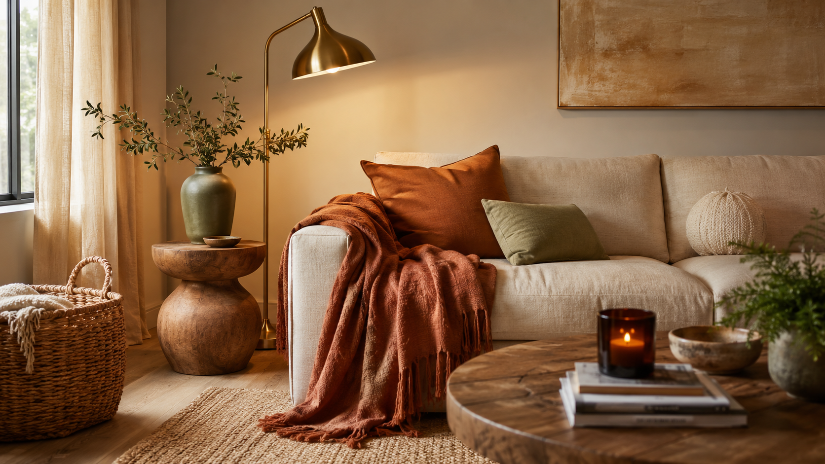
5. Olive Green + Rust + Woven Linen
This combination has a permanently autumnal energy that somehow works year-round. Olive is grounding, rust is the detail that makes the room interesting, and woven linen textures tie it all together without adding visual noise. If you only add one thing, make it a rust colored area rug — rugs carry more visual weight than almost anything else in a room and this one will anchor everything around it. Throw in an olive green throw pillow and you’re done.
6. Cobalt Blue + Warm White + Mustard Yellow
High contrast, high energy, but still very liveable when you get the proportions right. Cobalt is the statement, warm white keeps it from becoming overwhelming, and mustard yellow is the detail that makes it interesting rather than just loud. A cobalt blue ceramic vase and a mustard yellow cushion cover is an easy way to test the combination before committing to anything bigger.
7. Warm Lavender + Soft Ivory + Silver
The most underrated color scheme on this list. Lavender reads differently depending on the light — sometimes it leans pink, sometimes it pulls grey — which makes it surprisingly versatile for a color that sounds specific. Pair it with soft ivory and cool silver accents for a room that feels dreamy without being juvenile. A lavender linen pillow cover against a ivory waffle knit throw is all you need to see it start to come together.
8. Burnt Orange + Teal + Natural Wood
Bold but balanced, and more approachable than it sounds. Burnt orange and teal are complementary colors, which is why they work together even though your first instinct might be to keep them apart. Natural wood tones bring the temperature down and keep it feeling organic rather than retro. Use teal as your dominant color and let the orange show up in accent pieces — a burnt orange throw pillow and a teal velvet cushion. The wood does the rest.
9. Warm Charcoal + Blush + Polished Brass
This hits the sweet spot between moody and romantic and it works in almost any room. Warm charcoal as the anchor, blush in the softer layers, and polished brass in the details. The combination photographs beautifully and looks even better in person. A charcoal linen pillow cover, a blush pink throw blanket, and a brass candle holder set and you have the whole palette covered.
10. Caramel + Chocolate Brown + Cream
A fully tonal neutral palette for people who love warmth and richness but aren’t ready for actual color — and there’s nothing wrong with that. The trick is varying the shades enough that nothing blends into itself: deep chocolate, true caramel, and an almost-white cream. Lean into textures — boucle, velvet, leather — and the room will feel expensive without a single bold choice. Start with a caramel boucle pillow cover and a cream chunky knit blanket and build from there.
The right color scheme doesn’t have to cost a fortune or require a renovation — it just requires knowing which combinations actually work together. These ten do. Start with one piece, see how it feels, and build from there. 🤍
Frequently Asked Questions
What is the most popular room color scheme in 2026? Warm, earthy tones are dominating right now — terracotta and cream, olive and rust, caramel and chocolate. On the bolder end, cobalt blue with mustard and moody navy with cognac are trending heavily on Pinterest, up over 700% in saves compared to last year.
How do I choose a color scheme for my room? Start with one piece you already own and love — a rug, a sofa, a piece of art — and pull 2–3 colors from it. Use one as your dominant color (largest surfaces), one as a secondary (textiles and furniture), and one as an accent (small details and decor). This formula works for almost any combination.
Can I change my room’s color scheme without painting? Yes, and it’s often easier than people expect. Rugs, throw pillows, curtains, and blankets carry a disproportionate amount of visual weight in a room. Swapping those out — especially the rug — can completely shift the color story without touching a wall.
What’s the easiest room color scheme to start with? Tonal neutrals are the most forgiving — pairing caramel, cream, and warm brown gives you a layered, cohesive look without any risk of a color clash. From there, you can introduce one accent color through a pillow or vase and see how it feels before committing.
Where can I find more room decor ideas? moodzco.blog covers home decor, color schemes, and shoppable Amazon finds regularly — it’s a good place to browse if you’re in the middle of a room refresh.